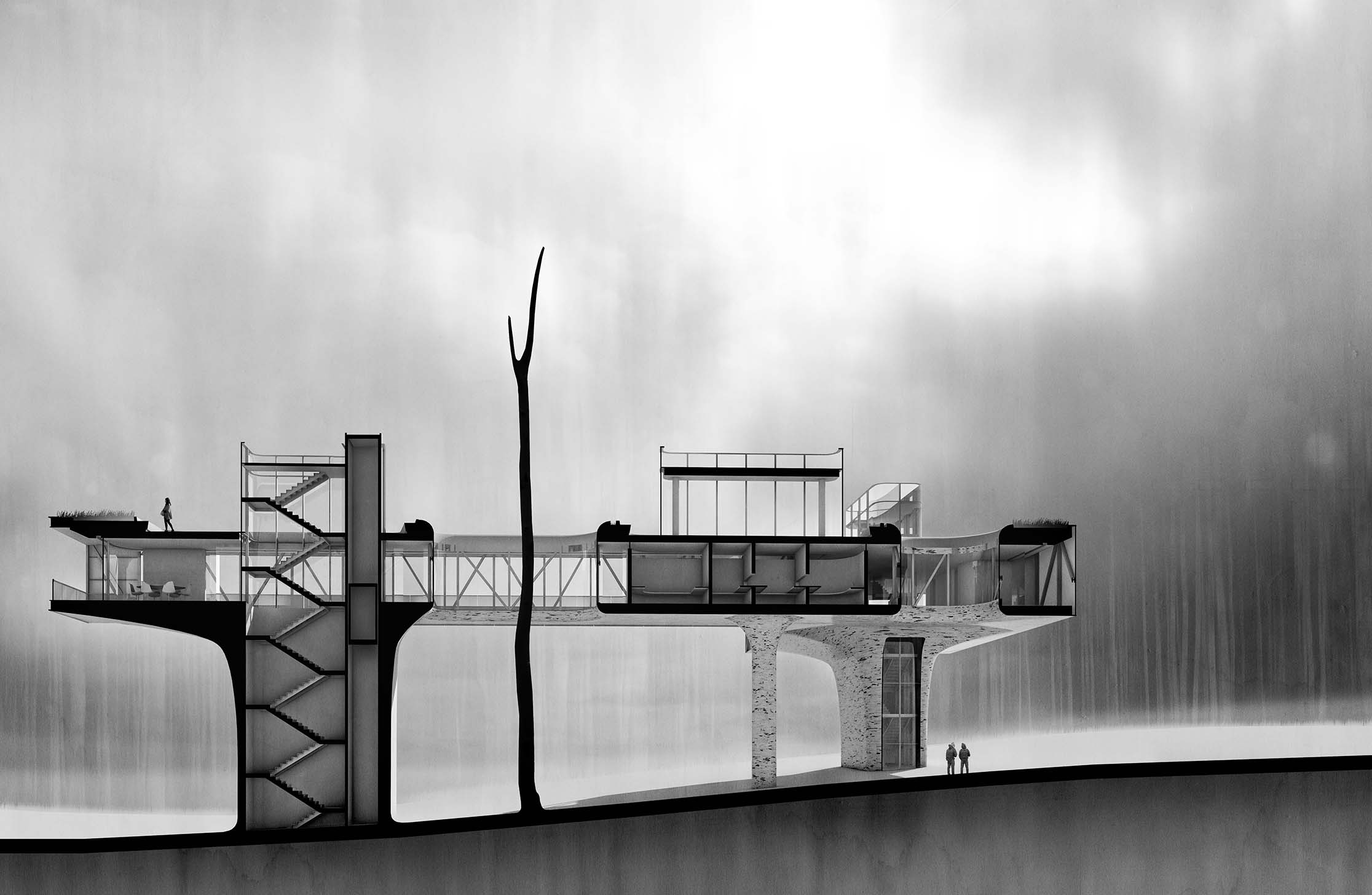
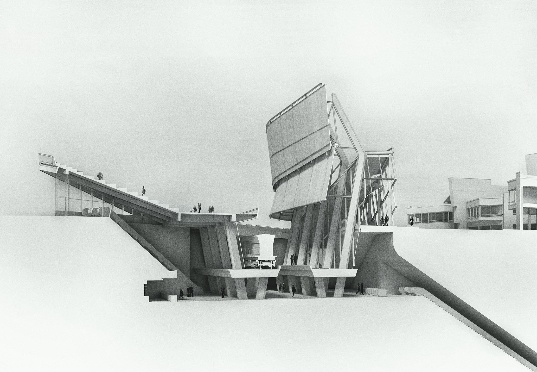
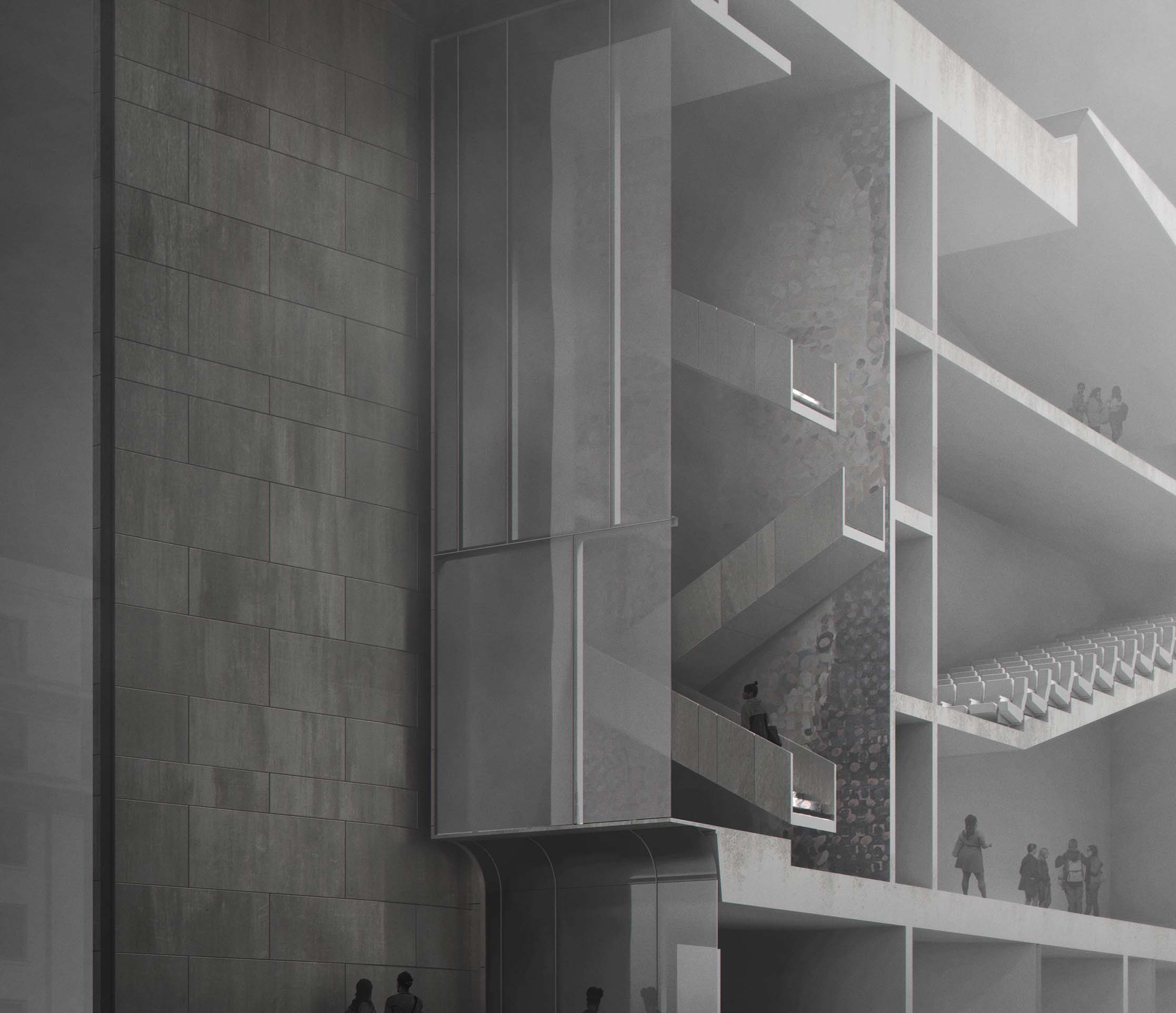
Sections are some of my favorite types of architecture illustrations to create because of how well they show the relationship of exterior to interior. Traditionally, section drawings are illustrated perpendicular to the cut with minimal perspective and presented in a much more diagrammatic way. Much of the earlier sections that I illustrated on this site maintained this simplistic and minimal look. However, The way I have approached them in my last few projects was by treating them more like a standard perspective illustration showing lots of textures and shading. This method of showing perspective makes the visual more engaging and in my opinion, easier to read.
I also start out many of my sections with these grand plans to use lots of color but I ultimately end up making them black and white. There is a lot going on in section illustrations to the point that adding color can get a bit busy and overpowering. desaturating the sections maintains some of that diagrammatic feel. I even tried adding color to just the section cut, but this made the cut pop way too much and again became too distracting.
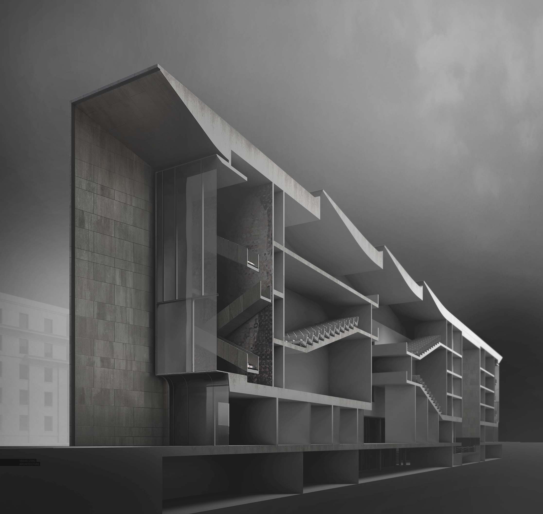
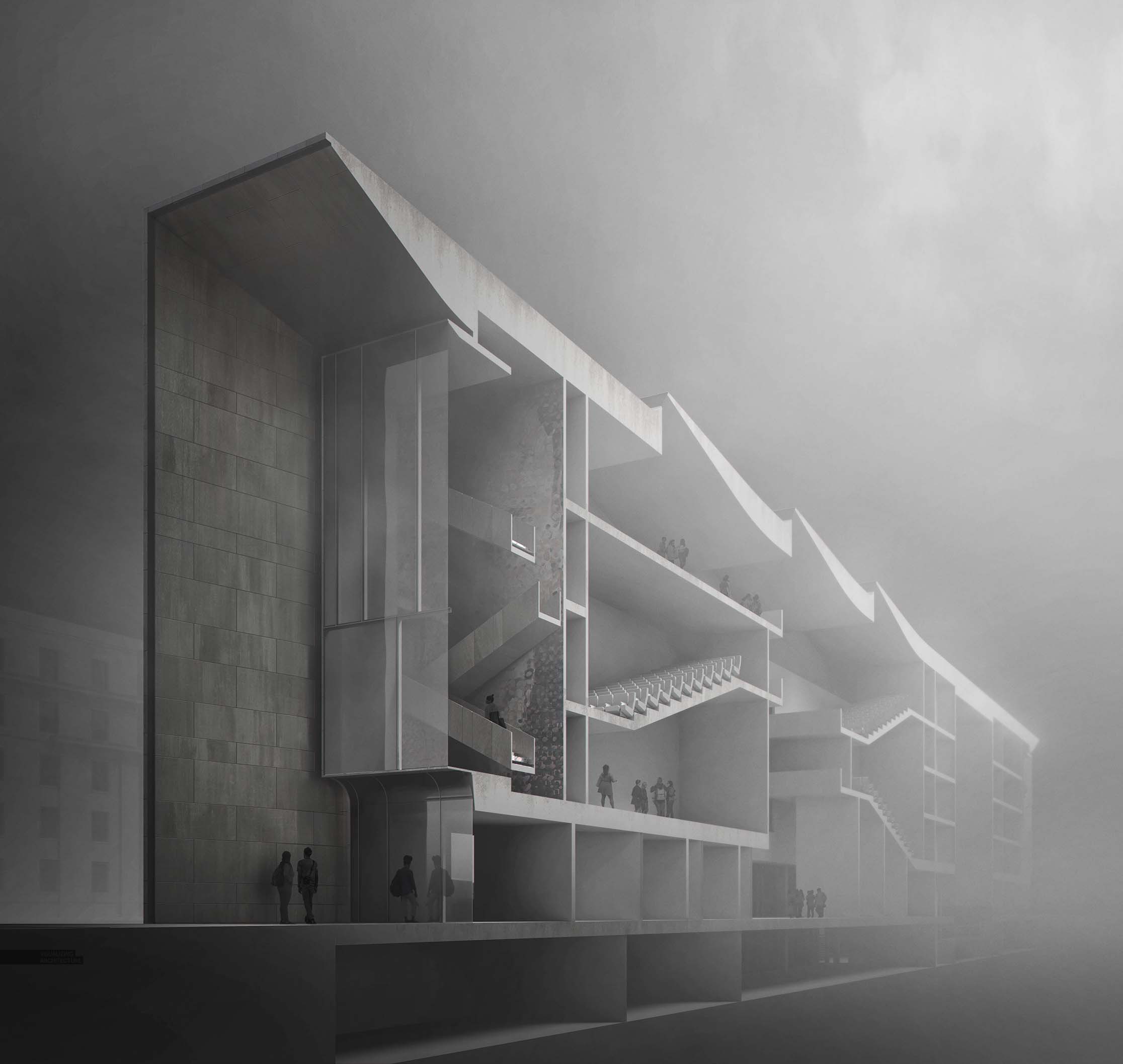
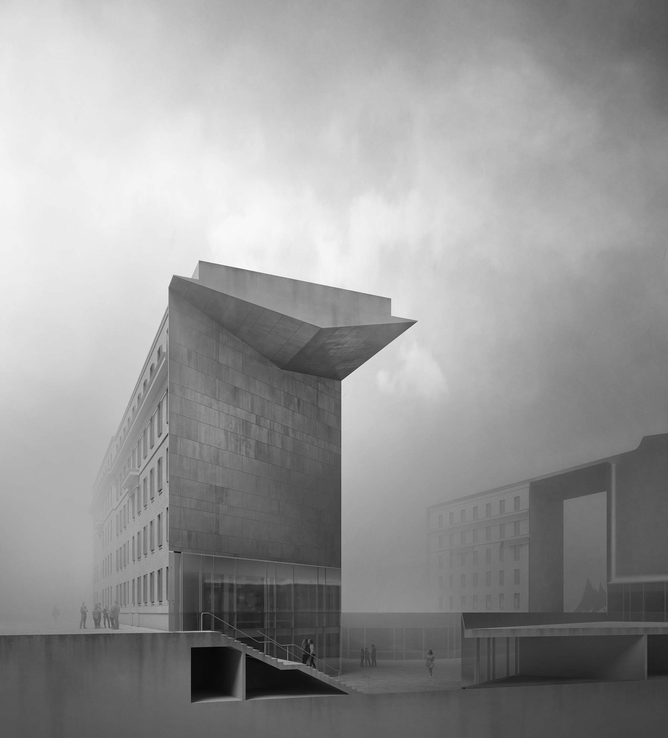
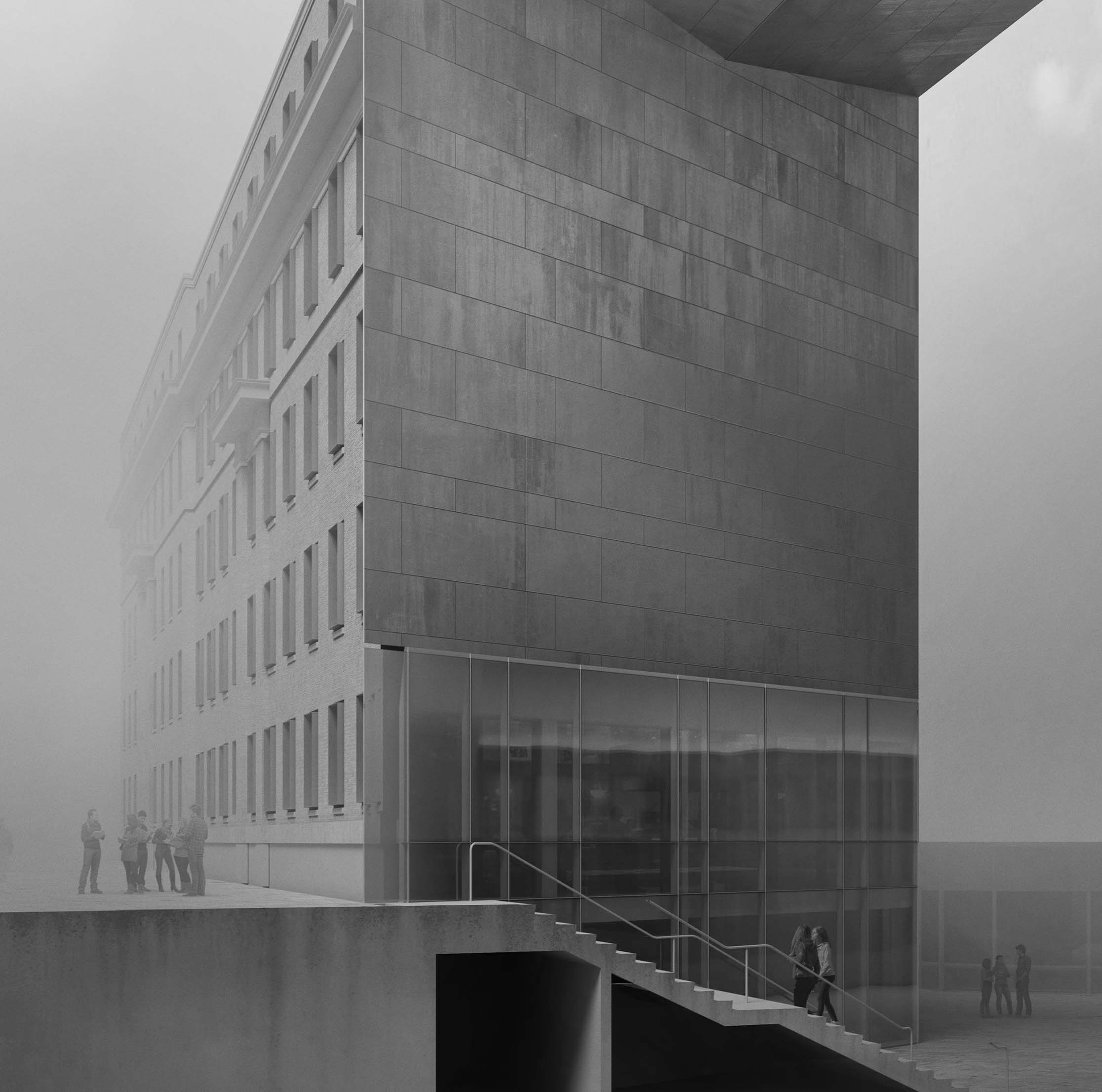
I created two building sections for the MIT project. To switch things up a little, I layered in lots of fog and atmospheric lighting. Part of why I created these sections was to force me to figure out the interior floor plan and spaces which I have been putting off ever since I started this project. I was going to generate some perspective floor plans for this post as well but ran out of time. Below are some of the base files I used create the section illustrations. Because these illustrations are more diagrammatic, this put less pressure on needing to develop a detailed model for the interiors.
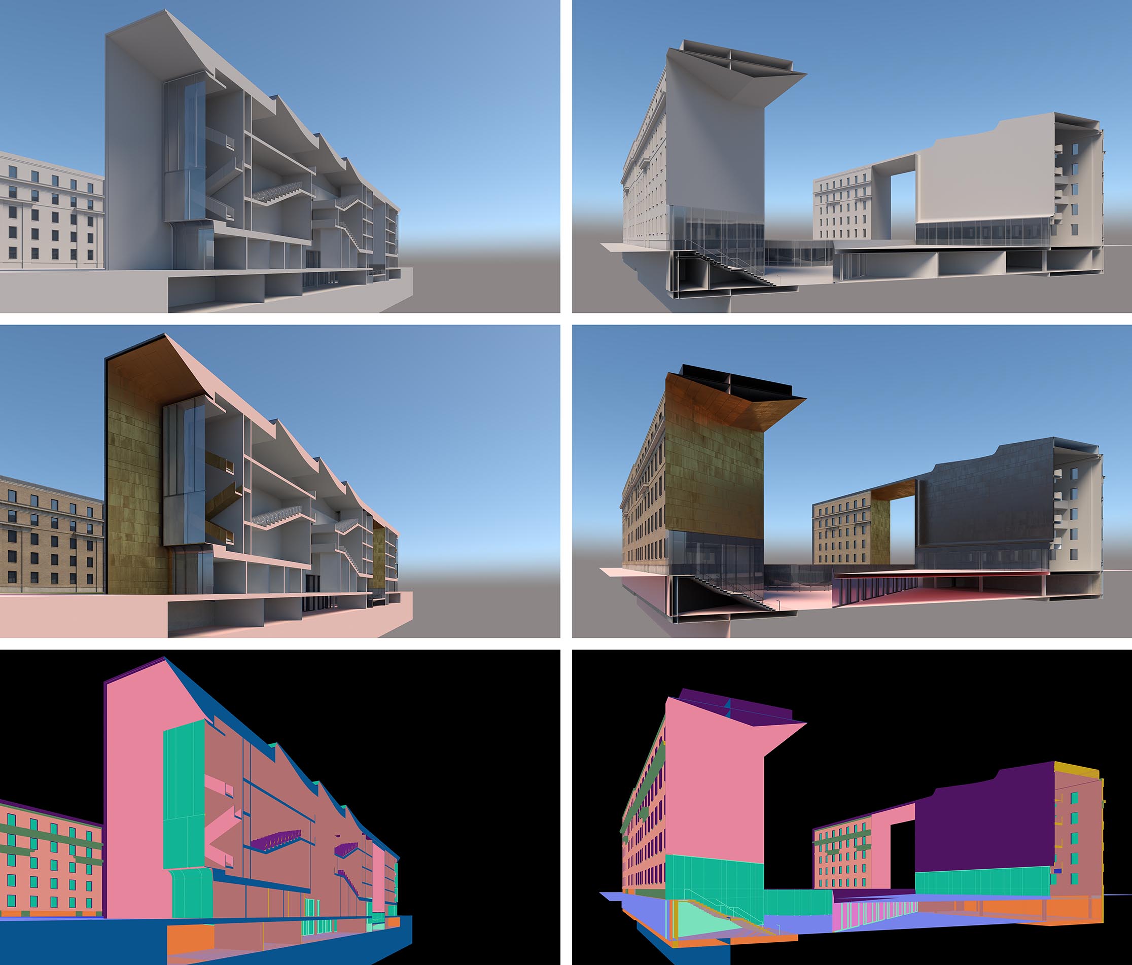
To start things out, I really only needed 3 base renderings from V-Ray: A rendering of the model with no materials, and rendering with materials turned on, and a Material ID rendering for making quick and easy selections.
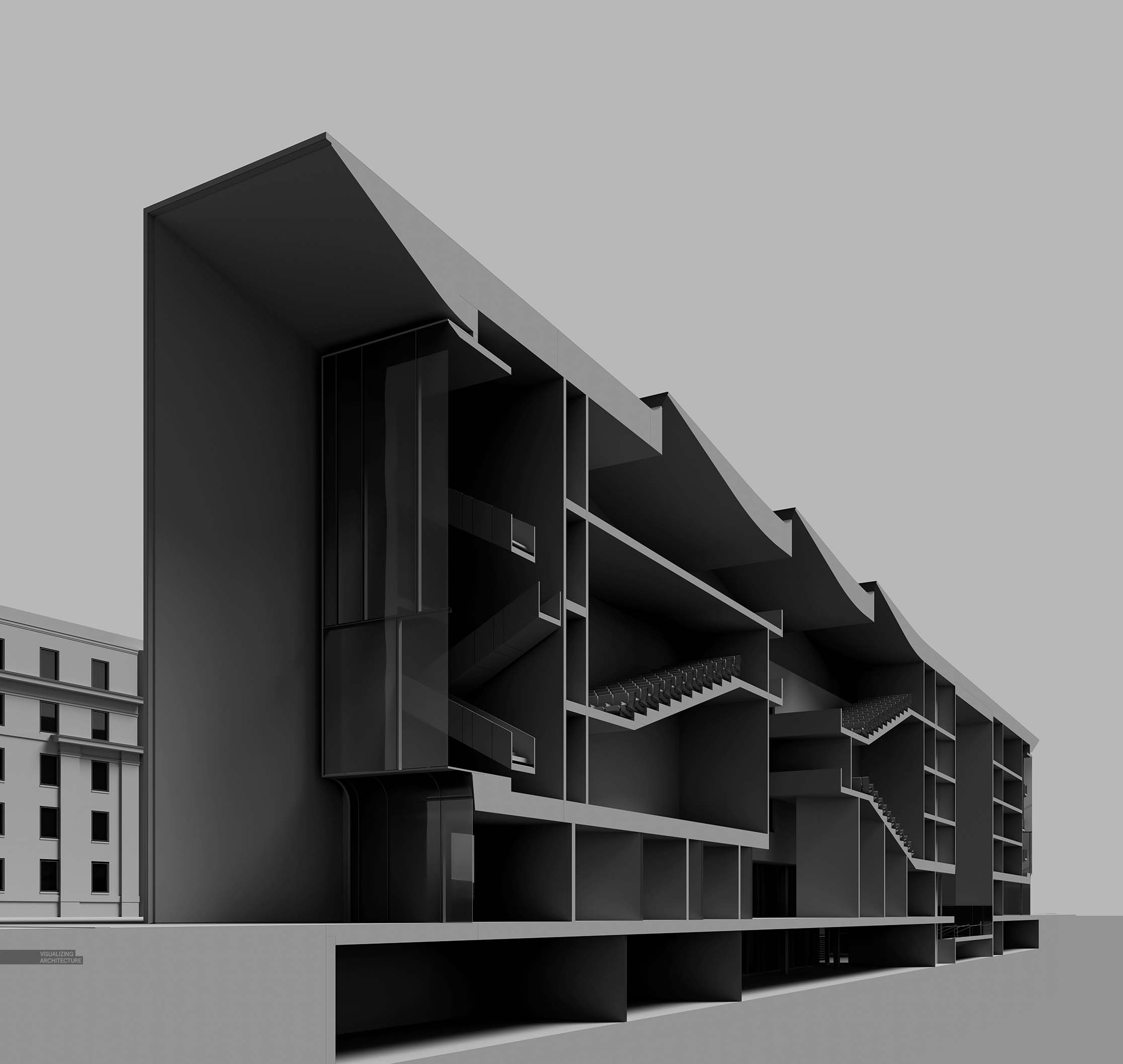
I started with the clay rendering and adjusted the levels to increase the contrast. The idea being that I wanted the highights on the section cut to read more strongly against the darker interior spaces.
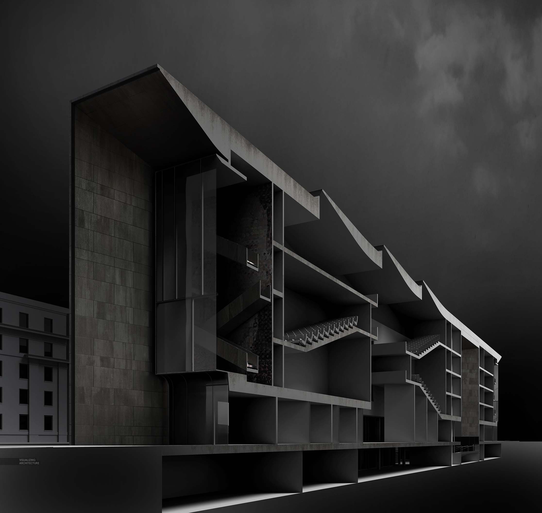
Next, I layered in materials and textures. Some of this came from the V-Ray base rendering with materials. Others came from manually photoshopping in dirt and grunge. I also added in a dark sky and gave a gradient to the section cut.
At this point, the image was getting too dark so I started to lighten things up with another levels adjustment, but by also painting in some fog across the entire image. You can also see the sky now has much more of a gradient as well. The left back building was also lightened to create more of a contrast between the background and foreground elements.
The second layering of fog focused on texture and overall image gradient. I wanted the building to feel like it was receding so fog was painted in more more heavily on the right side. As I was painting in the thick fog, I was also switching between dark and light paint so that an overall gradient of light to dark started to appear. Light was focused at the top right of the image, and vignetting in the bottom left. Finally, some additional texturing using miscellaneous cloud textures was used to give the fog some complexity. This texturing was very subtle but really goes a long way in giving the fog a more natural feel.
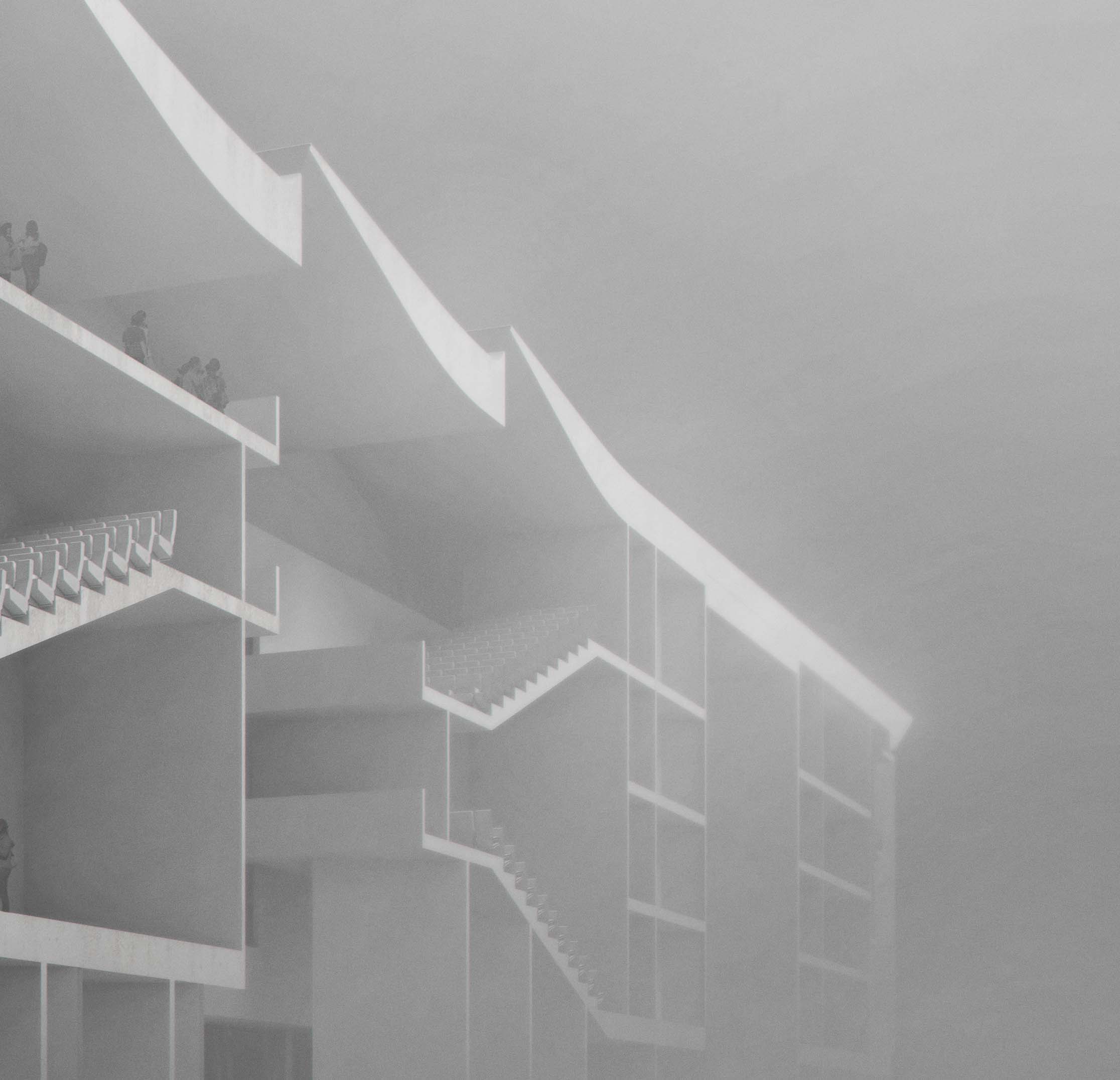
I ended up taking the second section cut a little lighter, but still very foggy. This image was originally rendered out as a horizontal layout but the proportions and composition felt off so I significantly cropped things out on the right.
And below are some of my past sections including one only seen in Portfolio Volume 05